DAVE KING, THE designer of what became the world-renowned Crass logo, has died at the age of 71 following a year-long battle with cancer.
Born in London in 1948, King later recalled how, as a youngster, he was struck by the unremitting greyness and dullness of post-War British austerity. “It seemed like the sky was always grey as well,” he remembered. “If you took a scan across the streets, everything was grey.” The one contrast to the monotony of this grey-and-white world, visible at the end of every street, were the lurid colours and bold designs of the advertising hoardings above the countless corner shops. Inside those stores, a young kid in search of escape from rationing and restriction could find other colourful treasures.
“There would be beautiful greens and blues for cigarettes,” he recalled. “For soda, oranges, reds, and yellows. And then the jars of sweets had bright artificial colours. The comic books and paperbacks were riots of colour”. In a world of unremitting greyness, these exciting, vibrant designs became for King “beacons” of something different, something enticing.
As a result, King decided, as he became a teenager, to pursue a life in art – despite the concern of his school Career Advisor who doubted that there were “any jobs for artists” going, at least none you might make a living at – except perhaps as a commercial artist. “Maybe that’s art you can get paid for,'” the Advisor suggested.
But while post-War promotional design had excited King, he did not relish a career designing packaging for consumables. The explosion of “the Sixties”, and the opening up of new, alternative avenues in art and culture, and new disruptive sensibilities about the nature of the production of art itself, became a far more conducive environment in which King could seek out a creative niche. “Suddenly people were wearing floral ties and pink jackets, there was mod fashion, and then there was commercial TV, which had much better graphics,” King recalled.
King became enthused by the new post-hippy phase of agitational and political work fermenting at Dial House
In 1964, King met Jerry Ratter (aka Penny Rimbaud) and Gee Vaucher whilst attending art school. King formed a strong bond with them both, which continued even after King later relocated to the United States. For a decade, he found work as both an art director and as an artist, but as his association with Ratter and Vaucher continued into the 1970s, King became enthused by the new post-hippy phase of agitational and political work fermenting at Dial House which would, within a couple of years, distill into the formation of Crass.
Rimbaud later recalled the moment that the pair of them were sat together at the house when, unprompted, Rimbaud “started a rant about Christianity”. The improvisation quickly expanded, as he launched poetic pot-shots at other instruments of social and political oppression. “It was this huge savage attack on everything inside me. I ended up rolling around on the floor screaming all this stuff,” Rìmbaud said. “When I finished, Dave picked me up and said, ‘You wanna write that’. Two days later I started writing it. It ended up as thirty-four pages of unremitting rant.” The result became the first iteration of Reality Asylum, which would begin life as a standalone written-word statement. It would only later become part Crass’ creative rubric as it evolved into a recorded performance piece.
King offered to design a logo that could adorn the front cover of the searing anti-religious, anti-authoritarian polemic that Rimbaud had authored. Rimbaud enthusiastically agreed, asking him to produce “a frontispiece which represented the fascism of the state, the fascism of the church, and the fascism of the family.”

This was a case where the artist felt completely in tune with the politics of their commission. “[W]e felt oppressed by the church… it was an arm of government”, King explained later. “It was in your high school education. You had compulsory classes called ‘Religious Instruction,’ which meant you had to sit in a class with some sort of ex-vicar or priest moonlighting as a teacher going on about how Christ is here to save us. It was indoctrination.”
King experimented with different iterations of his design, all of which shared a common premise: taking elements of existing symbols of oppression, power and domination and repurposing them into an icon which both codified and inverted the meaning of that symbolism.
He drew on components of the Christian cross and the swastika, adding in subtle references to national flags (most obviously the Union Jack). The design was completed with the inclusion of a stylised version of a two-headed Ouroboros (an ancient symbol of a mythical serpent who consumes their own tail). It was an inspired design decision, which completed the image with the powerfully subversive message that oppressive power would ultimately only consume itself.
In the years since, many have debated the exact, definitive meaning of King’s logo; offering a variety of interpretations. For the artist who crafted it, the symbol’s meaning was “very simple.” King conceived it as a visual statement “against monolithic religious and cultural oppression.”
After featuring on the first edition of Reality Asylum, the new logo had by 1977-78 become part of the iconography of Crass, and would go to feature on banners, handouts, badges and record sleeves. The image first came to national (and later international) attention when it featured on the cover of the inner-sleeve pull-out of The Feeding of the 5000, and soon after that as the silk-screened centre-piece of the cover of the vinyl release of Reality Asylum (the track omitted from the original release of Feeding at the insistence of the pressing company’s workforce).
King, of course, never saw a penny from the cumulative receipts of such tone-deaf profiteering
By the end of the 1970s, King had crossed the Atlantic to settle in New York. He joined the punk trio Arsenal (as drummer “Dirty Dog”), which morphed through a relocation to San Francisco to become Sleeping Dogs. The 1982 single Beware on the Crass label, showed the originality and potential of this new line-up, even as Rimbaud and Crass guitarist Phil Free augmented the band’s sound for the studio session. The front cover of the single featured its own striking logo, courtesy of King. Sleeping Dogs wound up soon after the Zig-Zag squat gig, re-emerging briefly in the new guise of Brain Rust a few years later.
Over the following years, what was now universally recognised as “the Crass symbol” would go on to adorn the backs and sleeves of punks’ jackets the world over; to become the tattoo design of choice for many punks looking for striking and unmistakable body art; and to be a recurring feature of countless endeavours in spray-paint graffiti. It’s become an internationally recognised icon throughout the global punk firmament: a signifier not only of the work Crass, but morphing into a wider visual shorthand for anarchist and DIY punk commitment. King was pleased to see it become “a signifier of both the band and a demanding, counter-cultural questioning of authority of all kinds.”
With varying degrees of success (and originality), numerous groups working under the banner of first-wave anarcho-punk were inspired to design their own band logo “closely based on” King’s work. The extent of the proliferation, replication, extension, pastiche and reinvention across and beyond the UK punk scene remains remarkable. King acknowledged that: “Many ‘homages’ have been made over the years, some the enjoyable work of genuine fans, others just blatant, barely altered rip-offs.”

From the late 1970s onwards, as profit-hungry parasites looked for ways to exploit the popularity of Crass, King’s design became the “go to” image for those knocking-out faux “Crass T-Shirts” and other ill-considered “merchandise” (in the face of outright condemnation from the band). King, of course, never saw a penny from the cumulative receipts of such tone-deaf profiteering. His landmark design for Crass was not in itself in any way a lucrative commission, financially.
If King was exasperated with that outcome, he never said so publicly. If anything, he seemed more than content with the impact, with the popularity and with the longevity of his “Crass logo”, its resonance continuing to reverberate down the decades.
Back in the late 1970s and early 1980s, those particularly close to Crass and to the work of Dial House often became aware of Dave King’s creative responsibility for the logo. It was a credit that was sometimes revealed by members of Crass to inquisitive editors during interviews for their fanzines. But it is only in more recent years, as individual attribution for the various elements of Crass’ work has become more transparent (itself, a highly contentious process amongst the band’s alumni) that King’s distinct creative contribution to the band’s work has gained due recognition. More people than ever before could now cite King’s name in the context of a discussion on Crass.
King went on to enjoy a long and varied artistic career in the US, but appeared sanguine at the recognition that no other work he produced had the same impact or popular resonance as his design of the Crass symbol.
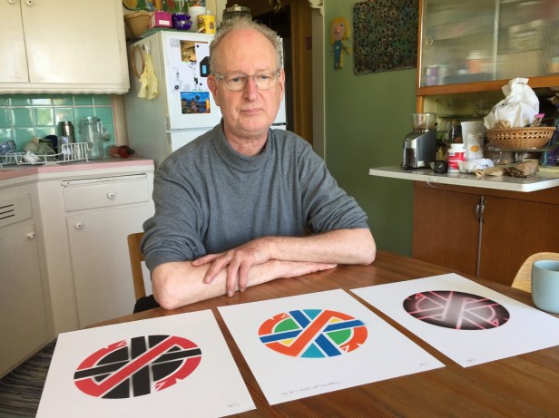
In recent years, he refocused his attention on that formative creative period. He wrote and published Secret Origins of the Crass Symbol, a fascinating exploration of the design choices that preceded and informed the definitive version of the logo. He contributed to the US video documentary series The Art of Punk, explaining different elements of his craft and his creative process. He also worked with different exhibition curators in the UK and US eager to showcase the work central to shaping the graphic identity of Crass, providing them with a wealth of illustrations and designs.
These opportunities to revisit encouraged King to experiment afresh with different interpretations of the original Crass logo. In a new set of images he reframed the logo in a variety of different ways, mixing in bold colours and repositioning the symbol in some unexpected contexts. For many fans of his work, used to seeing the image in imposing black-and-white for many decades, the colourized, reimagined versions of the logo took some getting used to. But all of the new iterations in different ways reinforced the recognition of how powerfully simple and potent the original “Crass logo” really was.
Dave King, 1948 – 20 October 2019
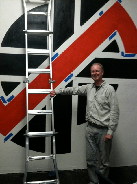
Dave King, at home in San Francisco, in April 2016 – photo courtesy of Sean Clark
REFERENCES
Alex Burrows. 2010. Penny Rimbaud on Crass & the poets of transcendentalism & modernism, The Quietus, 10 November, https://thequietus.com/articles/05258-penny-rimbaud-crass-interview.
David King. 2012. Free the Crass symbol!!! By the designer of the Crass symbol, Dave King. BoingBoing, 31 January. https://boingboing.net/2012/01/31/free-the-crass-symbol-by-t.html.
Sam Lefebvre. 2013. Not just another cheap logo: the story of Crass and David King, Consequences of Sound, 12 September, https://consequenceofsound.net/aux-out/not-just-another-cheap-logo-the-story-of-crass-and-david-king/.

Lived, left his mark, smiled then left.
Not a wasted life.
Peace, love, fraternity.
We can all be King’s
😉👍💕